For the first time since joining the NHL in 1993, the Florida Panthers have revamped their logo and jersey designs as part of an organizational rebrand.
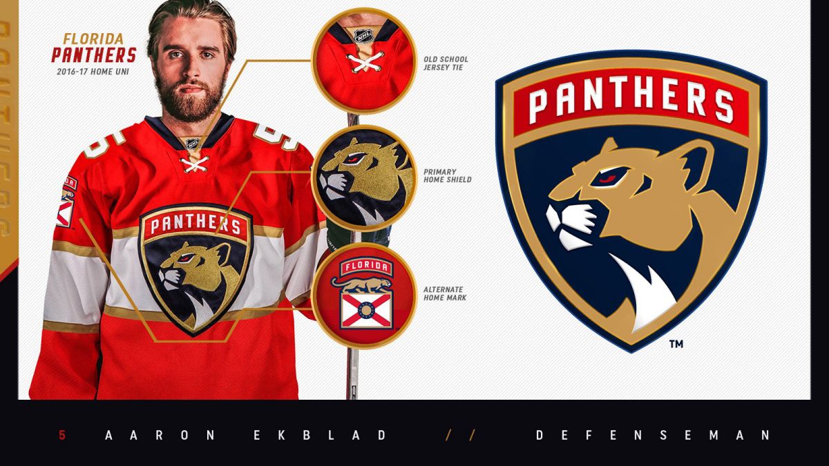
The team announced plans for the revamp several months back, and finally unveiled the new look at a lavish event this past week. The Panthers wanted a look that reflected their maturity as a franchise. Overall, the logo design draws heavily on the Army’s 101st Airborne Division patch. The color palette is white and red as the dominant motifs and the blues removed from everywhere but the collar and the background of the main patch. The mid-chest band with gold border offers a stark contrast to the new logo.
Subtleties in the design include a crossed neck string that evokes the Florida state flag, which also is utilized in concert with a prowling panther on the arm patches. Those will also feature a Florida (home) or Panthers (road) wordmark bar, but those particular patches will be added only once a player has made the 23-man roster. The team captain and alternative captains will also wear special bars in addition to the letters typically displayed on the left breast—a first in the sport. The team may opt to add other adornments for team all-stars, leading scorers and other milestones.
“I love it,” said Panthers defenseman Aaron Ekblad. “I don’t think our guys would hold back if they didn’t like it, but in all honesty, we like the look. It’s cool to usher in a new era with the team we have, what’s in front of us, with a new look. We’ve been building and it’s an uphill battle.”