Nothing fancy, but a little history and opinion on what jerseys I think are the top 5 within the Eastern Conference to add to your wardrobe.
– The Flyers joined the league in 1967 and have won 2 Stanley Cups in their day. Today, the Flyers are in 4th place sitting snug for a playoff spot. Donning the orange with white and black accents, you cannot help but like the jersey. Perhaps a little reminder of Halloween, or the black cuffs that add a little edge, the jerseys winged “P” represent speed.
– The Lightning are slowly climbing back into a playoff spot, a spot most fans thought would come with ease. Only 6 points out of 8th seed, the Lightning’s road jersey has flare with their blue accents with a primary white jersey. The logo is a lightning bolt, tweaked a bit over the years, today looking much like the movie Incredibles. Maybe it’s the combination of blue hockey pants and a white lightning bolt down the side with the jersey, but the jersey has a superhero feel that any grown-up can relate to from as a child.
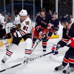
– One of the Original Six teams, the Rangers did it right when creating their third jerseys. An updated cut with a classic look, with “NEW YORK” written across the chest. The focus of this jersey is the inscription on the inside of the collar that reads “Established 1926,” and all retired numbers appear in numerical order on the inside of the jersey on the rear below the stripe.
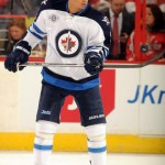
– So the new owners gave into trying to replicate the previous Winnipeg Jet’s colors and logo but still making it new. I think they have done a great job with paying respect to the Royal Canadian Air Force (RCAF), particularly Winnipeg’s 17 Wing. The logo is a silhouette of a McDonnell Douglas CF-18 Hornet on top of a Maple Leaf. Side note, the team had to receive permission from the Toronto Maple Leafs before using the leaf design. Some commented it looked like a target, perhaps a curling house, regardless, the jersey is a good combination of old and new.
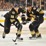
– The leagues third oldest team within the United States, the Bruins third jersey provides a little bit of the new style but not following the “circle” crowd. The jersey is primarily black and flip-flopped the primary logo with the shoulder patch. The bruin, now the main logo, is closely based off of Bruins jerseys used up until 1932. The team also used black socks with the third jersey, a first for the franchise. Dark, intimidating, all that of what makes up the the Big Bad Bruins.
There’s my Eastern Conference list; what jersey do you think should have been on it, from yesteryear to today?
