
Third jerseys are nothing short of another way for teams to have a different look and to generate additional revenue in terms of retail sales. They have their place, such as the Winter Classic and holiday games. Other teams, such as minor league clubs need gimmick nights with special jerseys to create buzz to get people to attend their games.
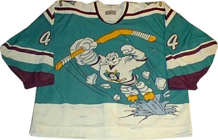
In the NHL, there have been some great and some God-awful third jerseys. The good ones include New York Rangers with the Liberty head, Edmonton’s retro look, and Pittsburgh’s blue Winter Classic kit. The ugly ones include Anaheim’s flying duck, New York Islanders’ fisherman, and Dallas’ constellation logo.
I believe that Calgary almost got this one right. Like many NFL teams, NHL clubs tend to over-rely on black as the primary color and I believe black could have been scaled down. I do love the Calgary script across the chest, but the flying C could have been removed. Their previous alternate was a throwback to the late 80’s bright red setup and while those were solid, I could see that a change needed to be made. The best alternate ones from Calgary I’ve seen was the Heritage Classic a few years ago.
Check out the video below and leave your comments on the jersey reveal.
