According to a recent blog post by Mike Heika, writer for the Stars Blog and reporter for the Dallas Morning News, the Dallas Stars will be sporting a drastically different look for the 2013-14 season.
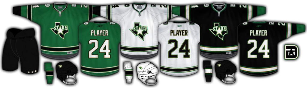
Part of that new look will be a brand new primary logo which will be featured on the Stars new jerseys. Additionally, the new jerseys will feature green as the dominant color.
The Stars are still in the midst of working with Reebok on prototypes of their new uniforms. Once the team approves of the new design, they will have to be sent to the NHL for approval. Due to the length of time it has taken, the Stars were forced to ask the NHL for an extension on their deadline to submit new uniforms for the 2013-14 campaign. After receiving approval from the league, the Stars figure to have until late January to submit everything.
Despite the Stars pushing for next season to unveil their new jerseys, it could be pushed back.
“There is a caveat that if they don’t think they have made the right choice, they could shelve it and then wait until 2014-15, but they seem ready to go forward with this right now.” notes Heika.
If you’re having a hard time imagining a green Dallas Stars jersey, check out the concept below courtesy of Icethetics. Let us know your thoughts in the comments. Would you like to see the Stars in a green jersey like the one below? What would you change if you were the designer?


Congratulations Stars. Worst looking jersey since the Islanders’ Gorten’s Fisherman years. The yellow/gold was a nice accent color. Makes me want to vomit.
i think dallas needs to scrap the black all together. Green gold and white
thier okay jerseys not the best though
Bring back the actual star pattern jersey please !
According to the last jersey change, when Reebok created the new fit of the jerseys, the cuts wouldn’t allow for the star pattern. I do miss those though.